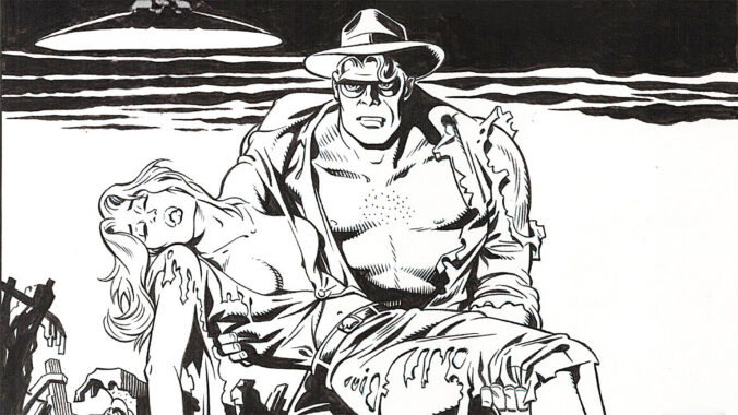
- Secret Agent X-9 (Dashiell Hammett & Alex Raymond)
- Denny Colt, aka The Spirit (Will Eisner)
- Dick Tracy (Chester Gould)
- Blacksad (Juan Díaz Canales and Juanjo Guarnido)
One of the most persistent questions in aesthetics is whether it is possible to appreciate a work of art created by someone whose actions or beliefs we find morally reprehensible. The debate is hardly new, but in the age of social media and cancel culture it has acquired renewed urgency. Every few months, a novelist, filmmaker, musician, philosopher, or painter becomes the subject of public controversy, and the same question returns: should their work still be read, watched, heard, or admired?
The issue is often framed as a choice between two extremes. One side argues that art should be judged solely on its artistic merits, independently of the creator’s personal conduct. The other contends that moral considerations are inseparable from artistic evaluation and that celebrating the work of a bad person amounts to excusing or normalizing their behavior. Both positions contain some truth, but neither is sufficient on its own.
A useful starting point is the observation that many of the greatest figures in cultural history were, by modern standards, deeply flawed individuals.
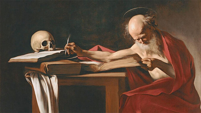
Consider the painter Caravaggio. Today he is regarded as one of the founders of Baroque painting, a revolutionary artist whose dramatic use of light and shadow transformed European art. Works such as The Calling of Saint Matthew and The Supper at Emmaus remain among the masterpieces of Western painting.
Yet Caravaggio also accumulated a remarkable criminal record. Court documents reveal repeated involvement in assaults, illegal weapon possession, vandalism, and public disturbances. In 1606 he killed a man, Ranuccio Tomassoni, during a violent confrontation and spent the rest of his life as a fugitive. Few would defend his conduct. Yet it is difficult to argue that knowledge of his crimes somehow alters the technical brilliance of his paintings. The paintings themselves do not advocate murder. Their artistic value does not depend on the moral character of their creator.
The same dilemma appears with Benvenuto Cellini, one of the great sculptors and goldsmiths of the Renaissance. His bronze statue Perseus with the Head of Medusa remains one of the landmarks of Florence. In his autobiography, however, Cellini openly boasted about killing several people. He treated violence almost as an extension of his artistic ego. Yet few visitors standing before Perseus in the Loggia dei Lanzi judge the sculpture according to the moral failings of its creator. They admire the sculpture because of its artistic achievement.
Another extreme example is the composer Carlo Gesualdo. Gesualdo murdered his wife and her lover after discovering their affair, a crime carried out with the assistance of his servants. The killings were notorious even in his own time. Nevertheless, centuries later he is remembered primarily for his astonishingly experimental madrigals, whose harmonic innovations anticipated musical developments that would not become common until much later. The horror of the crime does not erase the originality of the music.
These examples suggest that artistic achievement and moral character are not necessarily linked. A great artist may be a terrible human being. A virtuous human being may produce mediocre art. The qualities required for artistic excellence are not identical to those required for ethical excellence.
The problem becomes more complicated when we turn to modern figures because their victims, controversies, and consequences remain part of living memory.
The filmmaker Roman Polanski pleaded guilty in 1977 to unlawful sexual intercourse with a thirteen-year-old girl after providing her with alcohol and drugs. Many people regard this as sufficient reason to boycott his films. Others argue that films such as Chinatown, Tess, and Rosemary’s Baby remain important artistic works regardless of Polanski’s crimes.
The disagreement often stems from different understandings of what it means to watch a film. Some view it as a purely aesthetic experience. Others see it as an act that confers prestige, influence, and possibly financial support on the creator. The question is therefore partly aesthetic and partly political.
The philosopher Louis Althusser presents a different challenge. In 1980 he strangled his wife, Hélène Rytmann. Should that fact affect the evaluation of his theories about ideology, state power, or Marxism? Logically, the answer would seem to be no. A philosophical argument is either sound or unsound regardless of who makes it. If a mathematician commits murder, his theorem does not become false. Likewise, Althusser’s ideas must stand or fall on the strength of their reasoning. To reject a theory solely because of its author’s crimes is a version of the genetic fallacy: judging a proposition by its source rather than its content.
The case of Woody Allen is even more contentious because public opinion remains divided. Allen’s marriage to Soon-Yi Previn, the adopted daughter of his former partner Mia Farrow, generated widespread condemnation. For many observers the relationship itself was sufficient to permanently taint his reputation. Others distinguish between moral discomfort regarding his private life and artistic appreciation of films such as Annie Hall, Manhattan, or Crimes and Misdemeanors.
Again, the central question is whether the quality of the films changes because of what we know about the filmmaker. The films themselves remain exactly the same objects they were before the scandal became public.
Political controversies raise another set of questions. The poet Ezra Pound openly supported fascism and made antisemitic radio broadcasts on behalf of Mussolini’s regime during the Second World War. The novelist and essayist Mario Vargas Llosa supported Alberto Fujimori at one point in Peru’s political history before later becoming a critic. Jorge Luis Borges accepted an honorary degree from Pinochet’s government in Chile and made statements that many considered politically naïve or objectionable. The Brazilian novelist Rachel de Queiroz supported the military government that emerged after the 1964 coup.
Do these political positions diminish the literary value of their work? Many readers would answer no. Pound’s influence on modern poetry remains immense. Borges remains one of the most original writers of the twentieth century. Vargas Llosa’s novels continue to be admired for their narrative sophistication. Rachel de Queiroz remains a major figure in Brazilian literature. Their political judgments may have been mistaken, even profoundly mistaken, but literary quality is not determined by political correctness.
This leads to an important distinction: there is a difference between condemning an artist and condemning a work.
Suppose a novel explicitly advocates racial supremacy, political persecution, or sexual exploitation. In that case the objection is directed at the work itself. The ideas being criticized are embedded in the artistic object. The reader is not merely reacting to the author’s biography. The problematic content is present on the page.
The same would apply to a film that glorifies rape, a painting intended as propaganda for genocide, or a philosophical treatise defending slavery. Here aesthetic judgment and moral judgment become intertwined because the objectionable ideas form part of the work’s substance.
But many controversies involve works that are unrelated to the artist’s misconduct. Caravaggio’s paintings do not teach murder. Gesualdo’s madrigals do not defend adultery killings. Borges’s stories do not promote military dictatorship. Althusser’s theory of ideology does not depend on strangling one’s spouse.
In such cases, rejecting the work because of the creator’s behavior risks confusing two separate questions:
“Was this person morally admirable?”
and
“Is this work artistically, intellectually, or aesthetically valuable?”
The answer to the first may be no while the answer to the second remains yes.
This does not mean that audiences must ignore biography. Knowledge of an artist’s life can enrich interpretation. It can also create discomfort. A viewer who cannot enjoy Polanski’s films because of what Polanski did is not making an irrational choice. Moral emotions are part of human experience. Likewise, a reader may decide not to buy books by a living author whose views they find abhorrent. The mistake lies in assuming that personal revulsion automatically settles questions of artistic merit.
The strongest position may therefore be a middle one. We should neither excuse wrongdoing because someone produced great art nor pretend that great art ceases to be great when its creator proves morally deficient. Human beings are complicated. Artists are often worse than we would like them to be. Some are criminals. Some are political fools. Some are predators. Some are all three.
Yet if cultural history teaches anything, it is that artistic genius and moral virtue are independent variables. We may wish they coincided more often than they do. But they do not.
The challenge for modern audiences is to hold two ideas simultaneously: that certain actions deserve condemnation, and that certain works deserve admiration. The ability to maintain that distinction may be uncomfortable, but it is arguably essential for any serious engagement with art, literature, philosophy, and history.
An additional irony is that society routinely separates art from artist when enough time has passed. Millions admire Caravaggio without thinking about the man he killed. Visitors to Florence do not boycott Cellini’s sculptures because of his confessions of murder. Concertgoers rarely discuss Gesualdo’s crimes before listening to his music. Yet contemporary artists are often judged by different standards. Whether this reflects moral progress, media saturation, or simply the emotional proximity of recent scandals is debatable. What is clear is that time has a remarkable ability to transform criminals into historical figures and controversies into footnotes. The question, therefore, is not whether we separate art from artist, but when.
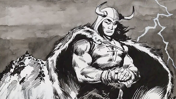
- Conan the Barbarian (Robert E. Howard and Roy Thomas)
- Thorgal (Jean Van Hamme and Grzegorz Rosiński)
- Dax el Guerrero (Esteban Maroto)
- Groo the Wanderer (Sergio Aragonés and Mark Evanier)
The life of William Lindsay Gresham reads like a prelude to the novel that would define him. Before becoming a writer of dark Americana, he was a man drawn to causes, extremes, and self-destruction. In the late 1930s, he volunteered to fight for the Republican side in the Spanish Civil War, joining the International Brigades. He saw the collapse of that cause firsthand. It left its mark politically, psychologically, and spiritually.
Back in the USA, Gresham struggled. He attempted suicide more than once. His personal life was not steady. He married the poet Joy Davidman, a brilliant and restless figure in her own right. Their marriage did not last. Davidman would later become known for her relationship with C.S. Lewis, while Gresham drifted further into alcoholism and instability.
Out of this turmoil came Nightmare Alley (1946), a novel that seemed to arrive fully formed, with a confidence and darkness that had few parallels in American fiction at the time. It did not fit comfortably into any category. It had elements of pulp, of noir, of psychological case study, even of allegory, but it resisted reduction.
Gresham never again produced a work of comparable power. His later books faded into obscurity. His health deteriorated: alcoholism, tuberculosis, and cancer compounded each other. In 1962, facing a terminal diagnosis and mounting despair, he checked into a hotel in New York and took his own life.
Before doing so, he had printed business cards. They read, simply: “No Address. No Phone. No Business. No Money. Retired.” It was less a joke than a final gesture. Dry, bitter, and entirely in keeping with the man.
Nightmare Alley follows Stanton Carlisle, a drifter who rises from carnival roustabout to celebrated mentalist, only to fall into degradation as a “geek”, the lowest form of sideshow performer, reduced to biting the heads off chickens for spectacle. The arc is simple. The execution is not.
Part of the novel’s power lies in how convincingly grounded it is. Gresham had done extensive research into carnival life, spiritualism, and fraudulent mentalism. The mechanics of deception, coded language, cold reading, and staged séances, are described with clinical precision. There is nothing supernatural here. Every illusion is explained.
And yet the novel never feels merely realistic. It operates simultaneously as a symbolic descent. Stanton’s rise is not just social or financial. It is metaphysical. He convinces himself that he is more than a fraud, that he can manipulate not just people but fate itself. His downfall, then, becomes inevitable, not as punishment, but as exposure.
The world of the novel is distinctly American, rooted in the 1940s fascination with spiritualism, self-invention, and the promise of reinvention after the Depression and the war. But its themes extend beyond that context. The hunger for belief, the ease of self-delusion, and the thin line between performance and identity are not tied to a specific era.
What, then, is Nightmare Alley? It can be read as noir, with its moral ambiguity and fatalistic trajectory. It can be read as existentialist, in its portrayal of a man constructing meaning only to find it hollow. It can also be read, more simply, as a deeply cynical view of human nature, one in which the desire to be deceived is as strong as the desire to deceive. The novel resists classification because it is doing all of these things at once.
The first film adaptation, Nightmare Alley (Edmund Goulding, 1947), is a fascinating object. It is both faithful and compromised, daring and restrained.
Casting Tyrone Power as Stanton Carlisle was, at the time, a departure. Power was known for romantic leads and swashbucklers. Here, he plays a manipulator and a fraud, charting a descent that his screen persona had not previously suggested. The performance works precisely because of that contrast: the charm is credible, and so is the corruption.
Visually and thematically, the film draws on earlier traditions. One can see echoes of Paul Leni’s The Man Who Laughs in its expressionist touches, and of Tod Browning’s Freaks in its depiction of carnival life not as spectacle alone, but as a closed, precarious community with its own rules and hierarchies.
Within the broader tradition of film noir, Nightmare Alley occupies an unusual place. It lacks the urban setting typically associated with noir, at least in its first half, but it shares the genre’s fatalism and moral darkness. Stanton is not undone by a femme fatale alone, he is undone by himself.
The film’s greatest weakness is also its most discussed feature: the ending imposed by producer Darryl F. Zanuck. Where the novel concludes with a devastating circularity (Stanton becoming the very geek he once pitied), the film softens the blow. It introduces a note of redemption, or at least the possibility of it, that feels unearned and tonally inconsistent. The result is a film that approaches greatness but stops short of it, constrained by the expectations of its time.
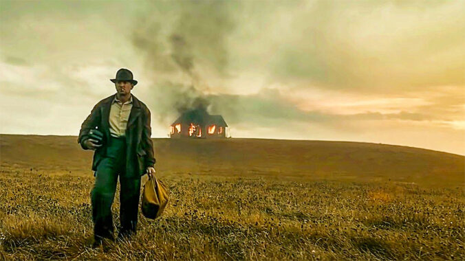
The screen retelling, also called Nightmare Alley (Guillermo del Toro, 2021), moves beyond simply remaking the 1947 film. Instead, it returns to the novel and reinterprets it with a contemporary sensibility.
From the outset, the film is more expansive. The carnival sequences are longer, more detailed, and more tactile. Del Toro lingers over textures (wood, canvas, mud, flesh) that ground the story physically while reinforcing its thematic weight. The world feels inhabited, not stylized.
The casting is precise. Bradley Cooper brings a controlled intensity to Stanton, suggesting both ambition and fragility. Cate Blanchett, as Dr. Lilith Ritter, is not merely a noir archetype but a fully realized counterforce: cool, analytical, and ultimately more dangerous than Stanton because she understands the game more completely.
What distinguishes this adaptation is its willingness to embrace the full darkness of the source material. There is no imposed consolation. The narrative is allowed to complete its arc, and the final transformation of Stanton is rendered with a clarity and inevitability that the 1947 film avoided.
At the same time, del Toro introduces his own sensibility. There is a heightened attention to trauma, particularly in Stanton’s backstory, which reframes his rise not just as ambition but as escape. The film is more explicitly psychological, less interested in deception as technique and more in deception as identity.
It preserves what matters, the structure, the themes, the ending, while expanding the emotional and visual range of the story. In that sense, it does not replace the earlier film so much as complete it.
Nightmare Alley endures because it refuses comfort. In Gresham’s life, in his novel, and in its adaptations, there is a consistent refusal to soften the fall. The story insists that the distance between success and ruin is not as great as it appears, and that, under the right circumstances, anyone might find themselves at the bottom of the alley.
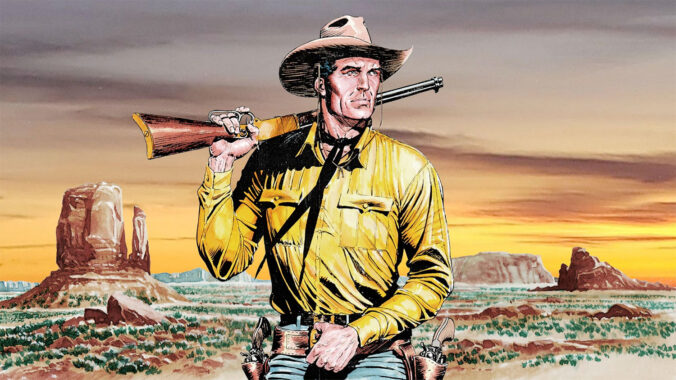
- Tex Willer (Bonelli & Galleppini)
- Blueberry (Charlier & Giraud)
- Lucky Luke (Morris & Goscinny)
Among video game enthusiasts, especially those who enjoy CRPGs, there is often an unspoken assumption that the “right” way to play is on the hardest difficulty setting available. Finishing a game on Normal is respectable. Finishing it on Hard is admirable. Finishing it on Nightmare, Insanity, Death March, or whatever intimidating name the developers have invented this time, is treated almost like a badge of honor.
I understand the appeal. Some of my favorite gaming memories come from overcoming difficult challenges. There is genuine satisfaction in mastering a complex combat system, learning enemy patterns, and finally defeating a boss that seemed impossible only a few hours earlier.
But as I’ve gotten older, I’ve found myself increasingly drawn to easy games and easy difficulty settings. Not because I can’t handle harder games, but because they often provide a different kind of enjoyment.
When I sit down to play a game, I am usually looking for relaxation rather than stress. Real life already provides deadlines, obligations, unexpected problems, and difficult tasks. I don’t need my leisure activities to do the same. Sometimes I simply want to spend an evening wandering through a beautiful virtual world, following an interesting story, and enjoying myself.
Easy difficulty allows me to focus on the parts of games I often value most: atmosphere, exploration, characters, and narrative. Instead of replaying the same battle twenty times until I finally win, I can continue moving forward and experiencing what the developers created. The challenge becomes discovering the world rather than surviving it.
There is also something liberating about not caring whether a game judges my performance. On easy mode, I am more willing to experiment. I’ll try unusual weapons, strange character builds, or reckless strategies, simply because they seem fun. When every encounter is a life-or-death struggle, experimentation often gives way to optimization. Players stop asking “What would be interesting?” and start asking “What works best?”
Time is another factor. As a teenager, I could spend an entire weekend learning how to defeat a particularly difficult boss. Today, I would rather spend those hours playing several different games, reading a novel, watching a film, writing, traveling, or simply enjoying a good meal with friends. Easy modes allow me to experience more games without demanding the same level of commitment.
I also think the obsession with difficulty sometimes confuses challenge with quality. A game is not automatically better because it is harder. Some games are memorable because of their stories. Others because of their art direction, music, characters, or world-building. Difficulty is only one element among many. No one would argue that a novel becomes better if every page contains a vocabulary quiz, or that a movie improves because the audience must solve a puzzle before each scene. Yet gamers often treat difficulty as if it were the primary measure of value.
Perhaps most importantly, games are entertainment. They are one of the few activities in life where there is no objective reason to impress anyone else. Nobody gives out medals for selecting Hard Mode. Nobody’s career depends on defeating a boss without taking damage. The purpose is enjoyment.
For some people, enjoyment comes from extreme challenge. For others, it comes from immersion, exploration, storytelling, or simple relaxation. Neither approach is superior.
These days, I play games the same way I travel. I am not trying to prove anything. I am there for the experience. If an easy setting allows me to enjoy that experience more, then that is the setting I choose. And I have absolutely no regrets about it.

- House of Leaves (2000), by Mark Z. Danielewski
- Perdido Street Station (2000), by China Miéville
- The Three-Body Problem (2008), by Liu Cixin
- The Yiddish Policemen’s Union (2008), by Michael Chabon
- The Martian (2011), by Andy Weir
- Ancillary Justice (2013), by Ann Leckie
- Annihilation (2014), by Jeff VanderMeer
In chronological order.
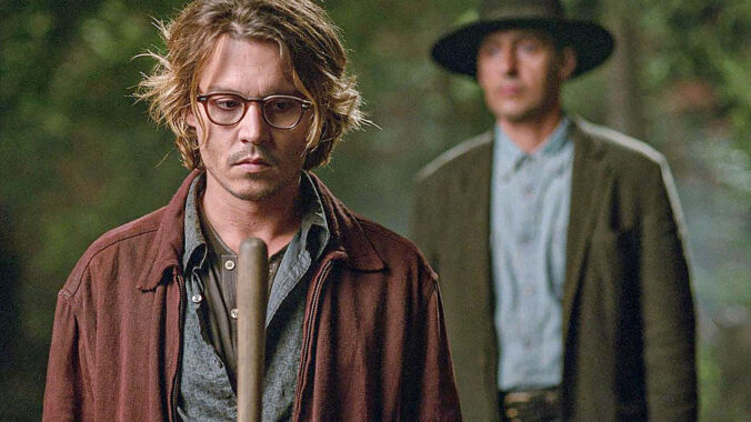
There’s a very specific narrative hook that shows up only occasionally in film: a writer comes into possession of a manuscript that is not theirs, and decides to pass it off as their own. It’s a narrow premise, almost schematic. Yet across three films, A Murder of Crows (Rowdy Herrington, 1998), The Words (Lee Sternthal & Brian Klugman, 2012), and Secret Window (David Koepp, 2004), it opens into three distinct genres: thriller, drama, and psychological horror.
The divergence doesn’t come from the setup. In all three cases, the situation is similar enough: a struggling or compromised writer faces a moment of temptation, and a text appears that could change everything. What differs is not the act itself, but how each protagonist responds to it and how the film chooses to interpret that response.
In A Murder of Crows, the reaction is pragmatic, almost opportunistic. The protagonist treats the manuscript less as a moral problem and more as a solution to a stalled life. The tone that follows is accordingly external. The story looks outward, toward consequences that take the form of pursuit, exposure, and danger. The question is not “should he have done it?” but “what will happen now that he has?” The film aligns itself with the mechanics of a thriller: escalation, suspicion, and the constant sense that something is closing in. Authorship becomes a liability, a trigger for events that move faster than the protagonist can control.
The Words approaches the same decision from the opposite direction. Here, the act is less impulsive than quietly rationalized. The protagonist is aware, perhaps too aware, of what he is doing, and the film lingers on that awareness. Instead of building outward momentum, it turns inward, toward reflection and consequence over time. The tension is not driven by immediate danger but by the slow accumulation of moral weight. Recognition, success, and admiration all arrive, but they are never uncomplicated. The premise becomes a vehicle for examining ambition, insecurity, and the cost of becoming the person you wanted to be under false pretenses. If A Murder of Crows asks what happens when you get away with it, The Words asks whether “getting away with it” is even possible.
Then Secret Window takes the same premise and bends it into something less stable. The protagonist’s reaction is not clearly opportunistic or reflective: it is defensive, even evasive. The accusation of theft, when it appears, is treated not as a legal or ethical dispute but as something more personal, more intrusive. The film doesn’t expand outward like a thriller, nor does it settle into introspection like a drama. Instead, it destabilizes the ground beneath the protagonist. Certainty erodes. The question of authorship, who wrote what, and who has the right to claim it, becomes entangled with identity itself. The premise is no longer just about taking a story, it is about whether the boundaries of the self can hold. In that sense, the film naturally slips into psychological horror. The threat is not exposure or guilt, but disintegration.
Seen together, the three films suggest that the core idea, publishing someone else’s work as your own, is less about literary ethics than about pressure points in the self. One protagonist treats it as an opportunity and is pulled into a world of external consequences. Another treats it as a compromise and is forced to live with its internal cost. The third cannot contain the implications at all, and the situation turns into something far more unstable.
It’s a useful reminder that genre is often less about plot than about emphasis. The same premise can generate suspense, reflection, or dread depending on where the camera lingers: on the chase, on the conscience, or on the fracture.
- Jurassic Park (1990), by Michael Crichton
- A Fire Upon the Deep (1992), by Vernor Vinge
- Doomsday Book (1992), by Connie Willis
- Snow Crash (1992), by Neal Stephenson
- The Children of Men (1992), by P.D. James
In chronological order.

I just saw the new Guardian’s 100 Best Novels of All Time list, created by “170 authors, critics and academics from around the world”, and I was appalled.
The top of the list leans heavily toward what might be called “prestige seriousness”: books that are endlessly taught, endlessly written about, and endlessly admired partly because admiring them signals cultural literacy. So you get the almost ritual elevation of Pride and Prejudice, Anna Karenina, and In Search of Lost Time near the summit. Now, are these important novels? Obviously. But “important” and “greatest reading experiences for actual human beings” are not the same thing. Lists like this often confuse influence, academic prestige, and emotional obligation with vitality. There is a certain kind of literary culture that treats admitting boredom with Proust as if one had confessed to kicking puppies.
The Virginia Woolf saturation is another example: five novels. That is not an accident. It reflects institutional taste. Mrs Dalloway and To the Lighthouse are understandable inclusions, but at some point representation becomes canon maintenance. Woolf is one of those writers whom critics adore discussing almost more than readers enjoy reading. Her importance to literary modernism is unquestionable, but five slots out of a hundred is excessive unless the goal is specifically “the history of high modernist prose technique”.
Tolstoy gets the same treatment. One can defend War and Peace and even perhaps Anna Karenina as monumental works, but when authors start receiving multiple guaranteed spots, the list stops feeling exploratory and starts feeling bureaucratic. It becomes less “the best novels” and more “approved monuments”.
Then there is Jane Austen, with a near-sacred aura surrounding her. She often benefits from a kind of critical inflation in which elegance, irony, and social observation are treated as inherently superior to ambition, imagination, or emotional scale. Pride and Prejudice could be considered well written, even charming and sharp, but it’s basically a story where the heroes are women whose main concern in life is to marry rich men. Does that deserve perpetual placement above wildly more ambitious works from world literature?
The Marilynne Robinson inclusion is almost comically predictable for this sort of list. Robinson occupies a very specific niche in Anglo-American literary culture: quiet, contemplative, Protestant-inflected seriousness written in pristine prose. Critics adore that combination. But outside literary circles, her cultural footprint is tiny compared to many omitted authors. When you see Robinson included while someone like Umberto Eco is absent, you can practically hear the seminar room humming in the background.
The Ernst Hemingway placement is especially revealing. Only one book, and low on the list, suggests a contemporary discomfort with old-school masculine prose and direct emotional architecture. He used to be unavoidable in these canons. Now he feels almost grudgingly retained, like an aging rock band reluctantly invited to the festival because the audience would riot otherwise.
Meanwhile, the omissions are honestly more interesting than the inclusions. No Paul Auster? That is bizarre for a list supposedly interested in literary innovation and postmodern identity games. No Ian McEwan? One can argue about individual novels, but Atonement alone has had enormous literary and cultural impact. No Kurt Vonnegut is another symptom of the list’s discomfort with humor, satire, and speculative fiction. Literary institutions often say they value imagination, but when voting time comes, realism and solemnity dominate. No Jack Kerouac is another classic establishment move. The Beats remain oddly suspect to elite literary culture because spontaneity, looseness, and countercultural energy age badly in academic environments that privilege polish and interpretability. And no Somerset Maugham hurts because he represents something modern literary criticism undervalues: readability. Maugham was one of the great storytellers of the 20th century. But “beautifully constructed and compulsively readable” now counts for less than “structurally interrogates memory and identity through fragmented temporality”.
No Umberto Eco is absurd. The Name of the Rose alone bridges literary fiction, historical fiction, semiotics, detective fiction, philosophy, and popular readability better than half the list combined. No Julio Cortázar and therefore no Hopscotch? That is one of the great modern novels about structure and reader participation. But Latin American literature in English-language canons often gets reduced to the obligatory García Márquez checkpoint. And the absence of Machado de Assis is honestly indefensible if the list pretends global scope. The Posthumous Memoirs of Brás Cubas anticipated modern metafiction decades before many Europeans supposedly invented it. Likewise, no Eça de Queirós means an entire literary tradition barely registers. The Maias is easily worthy of consideration.
No J.R.R. Tolkien is maybe the single clearest sign of bias. One can dislike fantasy, but excluding The Lord of the Rings from any serious “greatest novels” conversation is like discussing cinema without mentioning Kurosawa because samurai movies are “genre”. Tolkien shaped modern storytelling more than many of the approved literary names on the list.
And then, where is Les Misérables? If readability, emotional force, social ambition, historical sweep, and cultural influence matter, its omission is astonishing.
Contemporary literary institutions tend to overvalue books that align with current ideological and aesthetic priorities while undervaluing writers who were massively important to actual readers across generations. These lists often mistake “books that are rewarding to study” for “books that fully justify the existence of the novel as an art form”. Those are not identical categories. A novel can be technically revolutionary and emotionally inert. Another can be messy, uneven, melodramatic, yet unforgettable.
The funniest thing is that the Guardian itself admits the whole enterprise is subjective and argumentative. Which is true. These lists are less maps of literary greatness than x-rays of institutional taste.
In case the list disappears from its original place, I’ll leave a copy here for reference: 100 My Ántonia, 99 The Go-Between, 98 The Road, 97 Catch-22, 96 Pedro Páramo, 95 The Return of the Native, 94 The Known World, 93 Invisible Cities, 92 Sentimental Education, 91 Life and Fate, 90 Jacob’s Room, 89 The Left Hand of Darkness, 88 Ragtime, 87 The Line of Beauty, 86 The Turn of the Screw, 85 The Vegetarian, 84 The Talented Mr Ripley, 83 A Farewell to Arms, 82 The End of the Affair, 81 Buddenbrooks, 80 Rebecca, 79 Go Tell It on the Mountain, 78 A House for Mr Biswas, 77 The Rainbow, 76 Dracula, 75 The Bluest Eye, 74 Nervous Conditions, 73 Austerlitz, 72 Our Mutual Friend, 71 Kindred, 70 Jude the Obscure, 69 Crime and Punishment, 68 Blood Meridian, 67 The Man Without Qualities, 66 The Master and Margarita, 65 The Color Purple, 64 The Good Soldier, 63 White Teeth, 62 Half of a Yellow Sun, 61 The Rings of Saturn, 60 Howards End, 59 Never Let Me Go, 58 Disgrace, 57 The Sound and the Fury, 56 Mansfield Park, 55 The Waves, 54 Orlando, 53 The Transit of Venus, 52 The Golden Bowl, 51 My Brilliant Friend, 50 Wide Sargasso Sea, 49 A Fine Balance, 48 The Metamorphosis, 47 Vanity Fair, 46 The Leopard, 45 The Golden Notebook, 44 Giovanni’s Room, 43 Housekeeping, 42 The Magic Mountain, 41 Heart of Darkness, 40 Song of Solomon, 39 Their Eyes Were Watching God, 38 The Age of Innocence, 37 Invisible Man, 36 The Handmaid’s Tale, 35 Great Expectations, 34 Wolf Hall, 33 David Copperfield, 32 The God of Small Things, 31 The Prime of Miss Jean Brodie, 30 Frankenstein, 29 Pale Fire, 28 The Brothers Karamazov, 27 The Trial, 26 Don Quixote, 25 Lolita, 24 The Remains of the Day, 23 Midnight’s Children, 22 Things Fall Apart, 21 The Portrait of a Lady, 20 Wuthering Heights, 19 The Life and Opinions of Tristram Shandy, Gentleman, 18 Persuasion, 17 One Hundred Years of Solitude, 16 Nineteen Eighty-Four, 15 Moby-Dick, 14 Mrs Dalloway, 13 Emma, 12 Bleak House, 11 The Great Gatsby, 10 Madame Bovary, 09 Pride and Prejudice, 08 Jane Eyre, 07 War and Peace, 06 Anna Karenina, 05 In Search of Lost Time, 04 To the Lighthouse, 03 Ulysses, 02 Beloved, 01 Middlemarch.